|
Disclosure: This post may contain affiliate links, meaning I get a commission, at no cost to you, if you decide to make a purchase through my links.  Pantone is a company based out of Carlstadt, New Jersey that developed the Pantone Matching System, which is a standardized color reproduction system that allows a wide range of industries (fashion design, interior design, graphic design, product design, etc.) the ability to match colors without the need for them to have direct contact with one another. The Pantone Color Institute is a division of Pantone that highlights the top seasonal runway colors, forecasts global color trends, and selects the Pantone Color of the Year. To determine the color of the year, the team looks at color influences globally and across many different sectors, including the film and entertainment industry, art collections, fashion, design, and travel destinations. While Pantone is likely to come out with their 2021 Color of the Year in the next few months, I wanted to revisit their 2020 Color of the Year – Classic Blue.
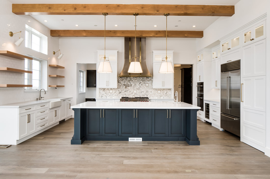
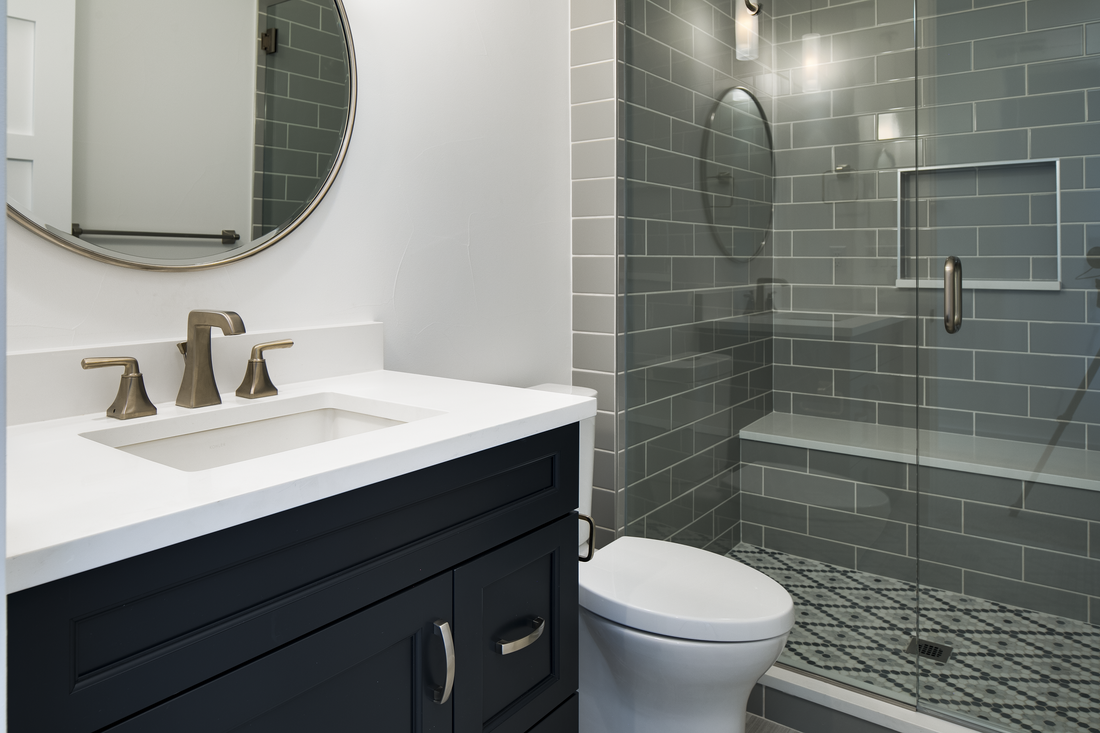
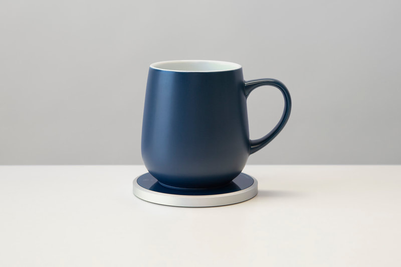
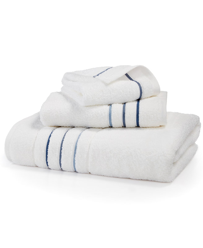
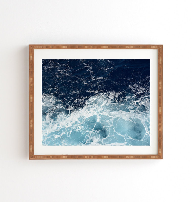
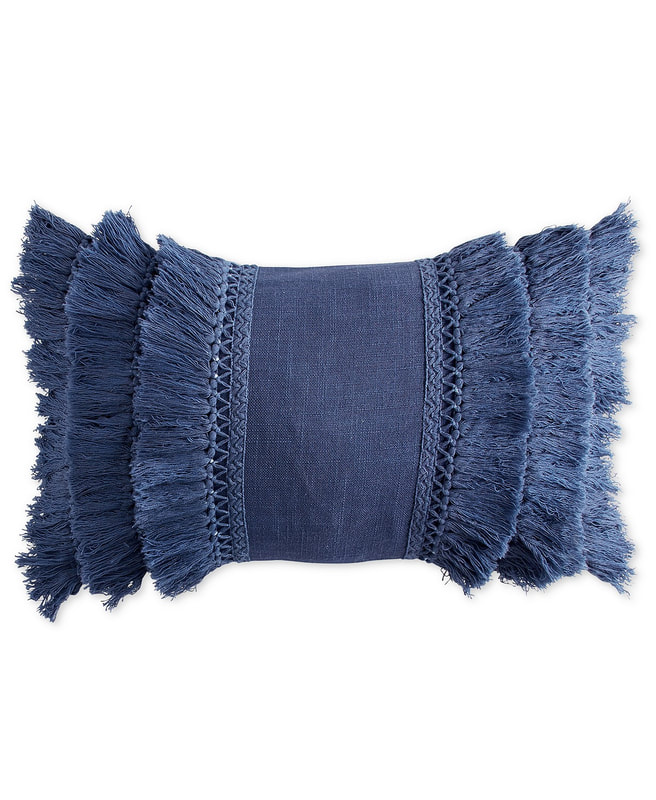
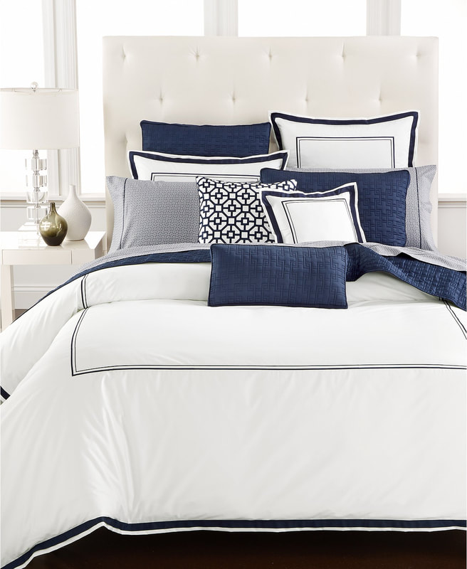
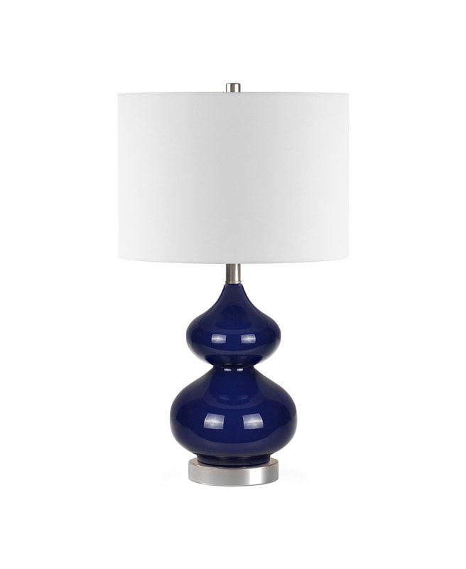
Blue is a primary color, falling between violet and green on the color spectrum. Blue is calming and relaxing and invokes a feeling of serenity. It’s also a strong color, signifying loyalty, trust and success. Think of the brands that are identified with the color blue: Intel, IBM, Tiffany & Co., and Facebook, to name a few. Blue is considered a “safe” color to use fairly freely in interior design. Because it invokes a feeling of calm, it’s a good choice for a bedroom, bathroom, or study. Blue can add depth to an otherwise neutral room, in the form of accessories like pillows, vases, throws, and art. Here are some ideas to incorporate this classic hue into your home! Do you have a love for the color blue like I do? How do you use it in your home?
2 Comments
|